Code for Princeton’s Art and Data Hackathon
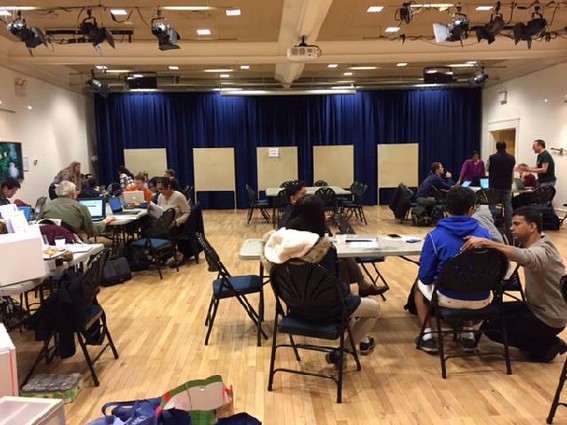
Last month, Code for Princeton held a very different kind of hackathon, one that combined data and art. When announcing the hackathon, the group said that it would explore how data could be visually compelling and informative, and how it could foster civic engagement through the creation of art based on the data. Over the course of the day, teams led by artists and coders created projects in the physical and digital realms that visualized data in a way that would promote public awareness of, and have a positive impact on, issues affecting the community.
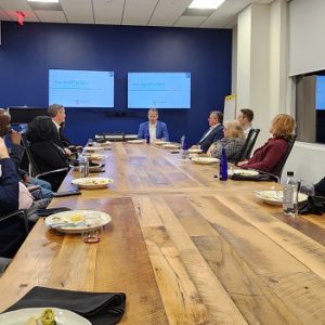
According to Code for Princeton Director Hema Malini Waghray, the West Windsor Arts Council (Princeton Junction) came up with the idea to hold a hackathon combining art and data. Code for Princeton has been in operation since April 2015. Some 50 coders and artists participated in this event.
When Data Turned Into Art
By Pragati Verma, Storyteller, Code for Princeton
What do artists and data-driven people have in common? Anyone who visited our Data & Art Hackathon this Sunday (Oct. 23) would say, “A lot.”
At the hackathon, you could see hard data from the local community being crunched and literally turned into stunning artworks. We teamed up with the West Windsor Arts Council to stage the hackathon, where techies, community members and artists came up with creative new ways of visualizing data to tell our community’s unique and compelling stories.
Steven Fragale, our keynote speaker, advised a crowd of data nerds and artists, “It’s important to always be reiterating and experimenting. There’s no time to be precious about anything.”
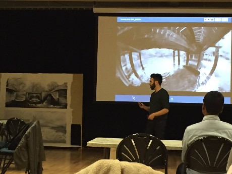
An artist/researcher at the Metropolitan Museum of Art’s MediaLab who specializes in virtual reality and digital techniques for sculpture and immersive drawing, Fragale created a powerful narrative with visuals based on water toxicity levels in a 360-degree virtual-reality environment.
Several techies, data scientists and artists worked through the day to create an interesting array of visualizations, from paintings to sculptures to animations to virtual-reality experiences that help us make sense of diverse phenomena, such as air pollution, traffic accidents, self-segregation in neighborhoods, energy usage and water toxicity levels.
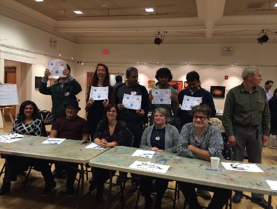
Here’s a glimpse of some of the stunning masterpieces that blurred the lines between art and information, as the hackathon participants experimented with new ways to showcase community issues:
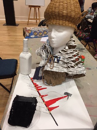
Uncrash
The winners of our Hackathon began by crunching New Jersey traffic data to identify the geographical points with higher incidences of crashes. They then used the data to create an eye-catching mixed-media piece that visualizes the various causes of these traffic accidents.
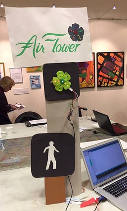
Air Flower
True to their theme of protecting the environment, the Air Flower team sculpted a flower that reports air quality by using coded lights to show the level of five major pollutants regulated by the Clean Air Act.
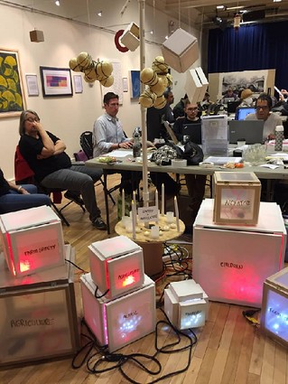
The Weight of a Word – A Twitter Crawl
It wasn’t easy to miss the sculpture with various wired boxes and contraptions. It was a physical equivalent of a digital word cloud, and was made by doing a data crawl on Twitter to understand the meaning of safety in the West Windsor area.
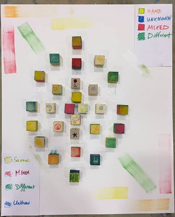
GIS Self-Segregation
Another stunning visual, this one alive with vivid colors, was driven by a quick poll at the Hackathon and a crunching of GIS data to understand and investigate the self-segregation of neighborhoods in West Windsor and around New Jersey.
Green Graph
An amazing, yet subtle, animation depicted patterns in Princeton’s electricity and natural gas consumption, and nudged people to think a bit more about their own personal consumption.