Another Successful Asbury Agile for Designers, Developers in Jersey Shore Area

On October 2, developers, UX designers and other members of the New Jersey tech community braved a coastal storm to gather in Asbury Park for the 2015 Asbury Agile Web Conference .
As the group’s website says, Asbury Agile is a friendly, informal, single-track conference for web professionals and students that is held annually.
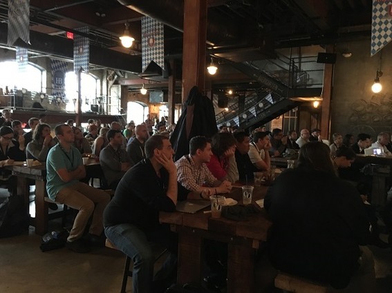
This year’s conference took place at the Asbury Festhalle & Biergarten and, as could be expected, the attendees sat at long beerhall tables while speakers, largely imported from New York, spoke about topics of interest from the front of the hall. Of course, lunch was brats and beer.
The day was packed with “news you could use,” as well as case histories discussed with a real-world technologists talking about the lessons they’d learned.
For example, to open the day, Ken Wheeler, a software engineer at Formidable Labs (Seattle), described the tools he and his team utilized to design, develop, test, deploy and debug complex applications.
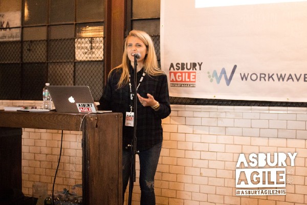
After his talk, Emily Brick, senior product designer at BuzzFeed (New York City), discussed her efforts to get design to permeate the company. Earlier in her career, Brick had work at startups where the practice of working in small teams made everyone into highly trained generalists.
When she got to BuzzFeed, the 10-person team she was assigned to seemed large to her. And she worried about a lack of critique and feedback due to the lengthy process used to design, develop and engineer pieces of the website. Design circulation occurred through a tool through which designers could post static mock-ups and share them.
Brick had ideas on how to speed things up. She wanted to develop packaged, tight CSS components that engineers could use across templates. This could make it easier to change things at the same time everywhere across the site. She also wanted designers to have a library of styles to reference, and she hoped to reduce the number of styles across the site.
The first attempt at this went awry, she said, because people began to modify the components. After a new VP of design came on board in January, “we set some goals for ourselves and made a pretty serious game plan.” The designers and a couple of engineers created some fundamental styles that wouldn’t interfere with the existing components, and they developed them in a way that no one could modify them. “We called the project ‘Solid.’ We wanted super-flexible building blocks so we could design the way we wanted,” she said.

“The goal was for anyone to come in, get an overview and easily see best practices” and how the code should be written. “We started building prototypes using Solid. It was a gateway for us. We wanted designers to think about their design in the context of coding, and that wasn’t happening before.”
Solid changed the way in which designers work with engineers at BuzzFeed. “It’s a way more efficient way for us to build. We are probably going to implement it in silos on the site until we have more experience with it,” said Brick. The idea isn’t to get rid of components, she added, but to develop them more thoughtfully. Instead of creating feature-specific components off the bat, the engineers now use Solid to implement blocks of markup. If certain blocks are being repeated, the designers can decide that they should be components, she explained. “So far, it’s been great and really fun to experiment with.”

