Etsy Creative Director Talks User Experience, Experimentation at NJETS Meetup

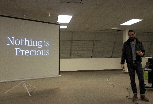
According to Randy Hunt, creative director at Etsy (New York) — the Web marketplace where independent merchants sell crafts and vintage and artisanal products — when it comes to the Web products his company designs, nothing is precious. Everything is expendable to provide users the best possible experience.
Hunt spoke about Etsy’s design philosophy to more than 100 tech entrepreneurs and developers at the New Jersey Entrepreneurs and Technology Startups (NJETS) meetup at JuiceTank (Somerset) on Dec. 12, 2013.
He said Etsy is constantly working to improve the user experience, through frequent experimentation. “No one thing we build or design is actually that important itself,” he noted.
Otherwise, Etsy’s designers would risk holding on to bad designs, Hunt said: “If we treat our user designs as precious, we tend to hold on to bad ideas for too long, avoiding incorporating things we learned.”
Hunt said he and his design team approach each new idea with the premise that they are “wrong most of the time.” This assumption lets the team consider how little design can go into each feature and what can be learned.
Hunt said what’s important about this assumption and method is that they allow you to “screw up.”
But if engineers approach new features by assuming from the outset that they are wrong, how can they ever ship a product?
According to Hunt, keeping the design cycles short is key, as is asking, “how little design can I do, how little can I invest in developing the thing and how quickly can I learn something about this [so] that I can change something immediately … and … do it different or better the next time I design.”
To demonstrate the constant testing that occurs, Hunt showed the group Etsy’s Browse feature — a way of exploring products on Etsy by category. He said his team had tested this feature by simulating a typical user’s experience.
After clicking a category, a user is presented with 12 of as many as 800,000 total items in that category. Hunt called this a problem that is “intimidating” to consumers, especially new ones. “How can they hope to find something they’re actually interested in with a list of close to 1 million items? Odds are these 12 items are not what they’re looking for,” he said.
To try to improve the user experience, Hunt and his team changed the product groupings to a shorter, more refined list. They tested photos to accompany each category but later scrapped the idea when the size of the page became unwieldy. They also tested drop-down menus for each category, to streamline the hierarchy of navigation, and an infinite-scroll feature, so users would not be required to click to each page of items.
But basically users ignored these features, said Hunt, noting, “They were terrible, terrible ideas.”
Etsy engineers also experimented with editorial content and discovered that visitors seldom engaged it, no matter how it was presented on the site. “We were hoping to merge commerce and content, but we later learned users didn’t really bother [with them],” he said.
But these attempts were not wastes of time. Hunt said his team was able to learn from each failed strategy. At each stage, the engineers collected data to determine why certain features had failed and others had succeeded.
Hunt noted that any change made to the product would not be well received by some visitors to the site, and constantly modifying the site for all users would confuse regular visitors. To allow testing of these modifications, the design team would launch new designs to about 1 percent of the site’s visitors.
The team can also define which audience segment it wishes to test with. If their design is translated to English only at that point in time, the engineers can deploy the test design to a segment of the users who have defined their language as English. Etsy will also test two types of designs with two different groups of people, to determine which is more effective.
Etsy employs 500 people in six offices around the world. More than 1 million merchants use the site to sell their products, attracting 60 million unique visitors a year. Etsy merchants sold $895.1 million and $1.4 billion worth of products in 2012 and 2013, respectively.
The company’s primary business model for revenue is to charge merchants 20 cents to list items for four months. If the item sells, the site receives a 3.5 percent transaction fee. “Ninety-six percent of merchant revenue goes to the merchants,” Hunt said. “What’s most important is our community of buyers and sellers.”

