End of Year- From our Friends at CMDS Marketing & Design Agency: Web Design Trends 2019
For our end-of-year articles, we are presenting some of the most interesting blog posts created by our friends in the NJ Tech community.
As the world becomes more and more connected, web design trends 2019 will be vital for brands trying to reach new audiences – who are more distracted than ever before.
The web is constantly evolving and adapting.
Designs and technologies are changing at such as fast pace that it seems almost impossible to keep up with the trends. But, it’s crucial to recognize the difference between a passing fad and a solid trend that will deliver solid results. From algorithm updates to colors, how do savvy businesses cope with these changes?
- They harness the power of their website, constantly refreshing it to meet the needs of their audience.
- They find new and unique ways to connect, interact and engage with customers online.
- They plan ahead and are open about new ways to reach their audience.
- They constantly adapt themselves to stay ahead of their competition.
In today’s competitive marketplace, it’s not just enough to have a great-looking website, it must also convert. Innovative conversion is the the name of the game.
2019 will be all about bright colors, natural shapes, interactive backgrounds, minimalist designs and building for mobile first. Out with the old. In with the new.
Read on and get inspired!
- Bright Colors
- Natural Shapes
- Interactive Backgrounds
- Minimalist Designs
- Building for Mobile First
Web Design Trends 2019: Our Five Favorites
Regardless of your business size
and industry, these web design trends 2019 can serve as your go-to-guide for
refreshing your website in the next year.
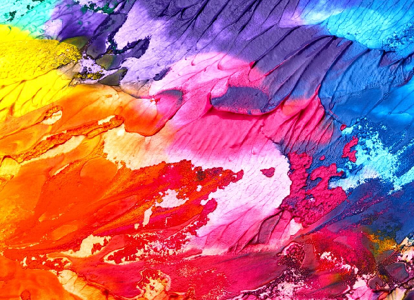
Bright Colors
Color is one of the most exciting tools for a designer to communicate a brand’s message. It not only has the power to draw attention, but also has a direct influence on emotions and actions For years, advertisers have traditionally used color to influence buying decisions. Making such a strong impact, it makes sense that color choices should also be carefully considered for a great website design.
Scientists have studied colors and their effects on our mood, feelings and behavior for centuries. For example, red is often a bold, attention-seeking color exuding power, confidence and action. In today’s world where first impressions are formed in a split second, color can help a designer capture a user’s attention and quickly communicate a message. And this year, they’re attracting attention with vivid compositions and bright colors.
Bright colors are created by using pure pigment (without adding gray or black). They’re excellent for attracting attention and highlighting call-to-actions. Too many bright colors can be distracting to the eye and actually decrease a viewer’s ability to remember information which is why it’s vital to find the right balance.
When used correctly, bright colors enhance all the right details and harness the audience’s reactions without feeling overwhelming. While supersaturation may not be appropriate in all situations, skillful use of bright colors help people focus their attention and give the illusion that the important elements are popping out from the background…almost as if they were pulsing with energy.
When it comes to web design today, people boldly take risks with color variations, blends and saturations. Color combinations can be hot or cold, light or dark, pale or bright. By correctly positioning color components, messages will be more easily understood and embraced. Using spacial relationships with depth and distance as well as altering colors are both easy ways to achieve this visual balance.
While 2019 will be the time of
bright, vibrant colors, the appropriate color palette will always be specific
to the brand and the audience that they intend to reach
Natural Shapes
When it comes to using shapes in web layouts, designers use them for a variety of reasons such as symbolizing concepts, conveying emotion, creating depth or influencing an eye-path.
This year, sharp-edged, straight lines are out. Natural and streamlined shapes are in…even Google, Facebook and Twitter think so. Instead of geometric shapes such as squares, rectangles and triangles with sharp corners, web designers are freshening up designs with thematic organic shapes with flowing lines that signify approachability and comfort.
Because they are imperfect and asymmetrical by nature, organic shapes provide depth to a web design that helps page elements stand out. Natural shapes are mainly nature-based but can be “man-made” with spontaneous, free-drawn elements such as paint blobs. Envision beautiful curves that create the illusion of movement, flexibility and connections.
But, like all web design trends,
keep in mind that if it doesn’t fit your brand identity, leave it out.
Interactive Backgrounds
Hey, what are you looking at? It’s OK, we realize your attention turned to the video above, right? It’s nearly impossible to ignore it since it’s moving…and since there’s food involved.
We all get distracted by things that move. Which is exactly why savvy brands today know that video is a critical component of a successful website. Once a unique decorative element to a website it is now an expectation. Interactive backgrounds and animations give brands the chance to make a memorable impression by immediately attracting the user’s attention even more so than a static image.
Video is here to stay.
The key is to inspire your audience
and showcase your unique vibe they won’t be able to find anywhere else. Whether
it’s through branded video content or animation, dynamic tools can be integrated to work
seamlessly in the background for scrolling or used as the focal point of the
homepage to deliver a very powerful branding opportunity. But don’t just pick a video
because it looks cool. It must be relevant to your business and audience’s
needs without creating chaos.
Minimalist Designs
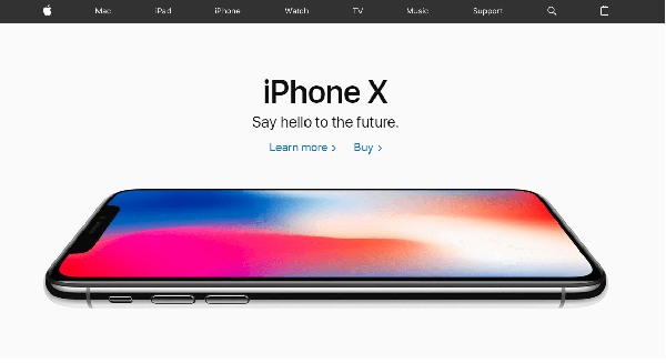
You’ve heard the saying, “less is more.” When it comes to websites, minimalistic designs with fewer elements can make a massive impact. It makes sense. Perhaps one of the most classic and timeless web design trends, minimalism is often the “go-to” design of choice. Apple is a prime example of using minimalistic designs.
The less fluff on a website, the less your target audience will have to think about. But that doesn’t give free reign to go in and delete most of the elements on a website without holding back. When designed correctly, a simple website will deliver what the audience needs, exactly how they need it for a better user experience.
Whether through white space, contrast or clear typography, minimalistic designs allow users to naturally focus on the right message without getting distracted by other things. The key is to understand what those important elements are first and then hone in on the details.
With consumers always on the go,
web designs must focus on offering what is absolutely essential to communicate.
Right here. Right now.
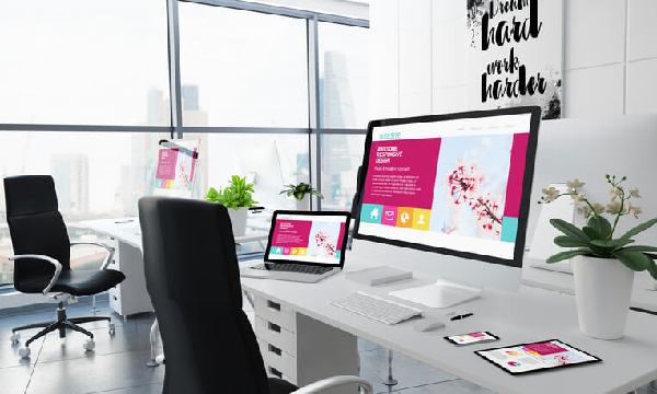
Building for Mobile First
Back in 2010, Google announced at the Mobile World Congress that web designers should put mobile first going forward. Now that mobile users are largely outnumbering desktop users, Google announced a change in algorithms to prioritize mobile-first indexing earlier this year. The goal is to encourage businesses to update to a responsive web design and enhance their online experience for mobile users.
“Every day, people are becoming more reliant on their smartphones to help make last-minute purchases or spur-of-the-moment decisions. In fact, smartphone users are 50% more likely to expect to purchase something immediately while using their smartphone compared to a year ago.”
Key elements, including a clean homepage design, simple navigation, seamless contact forms and usability, will enhance your customer’s experience and reduce bounce rates. At the same time, it will help with outranking the competition in Google’s search results as well.
But, building for mobile first is so much more than ensuring it has a responsive design that adapts to whatever screen your audience is using (although that is a huge part of it). It also involves creating designs that are based on understanding micro-moments. Micro-moments are the key reasons why a consumer would reach for their mobile device:
- “I want to know.”
- “I want to go.”
- “I want to do.”
- “I want to buy.”
“People are searching at the exact moment they need something and are looking for places that can meet their immediate need. In other words, when making these on-the-spot decisions, they are more loyal to their need than to any particular place.”
It is clear that a mobile design must start with data to help brands decipher what it is that these people are looking for and then respond with relevant content. If you can identify those micro-moments, you’ll have what you need to win over customers, even if they’re loyal to another brand.
CMDS, located in Colts Neck) is NJ’s Marketing and Design agency. We use