Technology Marketing in the Digital Age: How to make your logo a critical component to your company’s success

Consider your company logo. It’s like an old friend; with you through good times and bad. But, just like your home, sometimes it needs a touch up or even a full renovation.
Your company is more visible now than ever before in the history of business communications. A customer’s first impression of your company is first established online through your website and social platforms—before they ever have contact with you. They know what you sell, what others have said about you and your latest news. It’s all online.
So how can you ensure that the first impression is a good one? It starts with your logo. Begin by asking yourself these questions: What does your logo say about you to your online and social community of customers and prospects? And does it create maximum brand engagement for your company?
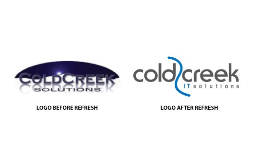
Take, for example, Cold Creek Solutions, an IT reseller in Denver. Recently my company helped them refresh their logo. They felt that it was dated and no longer appropriate in today’s IT marketplace. Moreover, it did not translate well to the company’s website, social platforms, or even printed on golf shirts.

The folks at Cold Creek Solutions, besides being expert technologists, also had the savvy to know that their logo was perceived by members of their business community as not keeping up with the times–a death sentence in the fast paced world of technology solutions.
Do you know the criteria involved in deciding if your logo is still appropriate for the current IT marketplace? Here are some key questions that will help you evaluate:
1-Is it clean and modern? Hint: no Wild West or Robotic style fonts
2-Does it include a globe? Today all businesses are globally reaching through the advent of social media and the Internet; a globe indicates a pre-Internet logo
3-Is it blue? Chances are, particularly if you are a technology company, you will answer yes. Try to go off the grid and use a different color. If blue is in fact a requirement, then simply experiment with some different hues. Make sure you use web safe colors when choosing your color palette.
4-Does it represent dated technology? Is there an outdated hardware component in your logo, such as a disc drive, a memory chip or a processor? The IT industry is dynamic and moves very quickly, and these components date themselves just as fast. In this case, more is less. Simple is better and no technology-like image is best.
5-Was it done professionally? Most people can tell if it was created by your high school nephew versus a logo pro. The latter will not only know how your logo will fare against the competition, but they will also give you customized fonts and unique hand-drawn elements. In Cold Creek’s case, the font was modified and the flowing creek-like graphic is customized.
Using your logo to portray a powerful, memorable visual for your stakeholders is a wise use of digital communications. In 2015, challenge yourself to evaluate your logo; decide whether or not it needs a refresh.
Then take the first step to show up as a force to be reckoned with in today’s IT marketplace. A strong and well thought out logo will help you strengthen your influence and build perceived value for your customers. Together, these beneficial by-products can help you create new opportunities and drive your business forward.
[Leadarati helps IT firms drive value and increase opportunities through social, digital and online communications.]

